Customize your baredSC plots
When --figure is used. baredSC generates plots and output text tables.
To use baredSC results in your publication, you may want to customize your plots.
Here is an example of python script you can use to customize your plots.
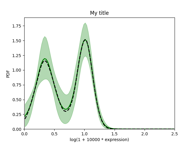
baredSC_1d
We assume you ran the Run baredSC_1d with default parameters.
We will use matplotlib to display the pdf with the error bar:
In [1]: import numpy as np
   ...: import pandas as pd
   ...: import matplotlib.pyplot as plt
   ...: # Get the pdf
   ...: pdf = pd.read_csv("../example/first_example_1d_1-3gauss_pdf.txt",
   ...:                   sep="\t")
   ...: x = pdf['x'].to_numpy()
   ...: # We assume x is equally spaced
   ...: dx = x[1] - x[0]
   ...: xmin = x[0] - dx / 2
   ...: xmax = x[-1] + dx / 2
   ...: # Plot PDF with 1 sigma
   ...: plt.figure()
   ...: plt.fill_between(x, pdf['low'].to_numpy(), pdf['high'].to_numpy(),
   ...:                  color='g', alpha=0.3, rasterized=True)
   ...: # Mean
   ...: plt.plot(x, pdf['mean'].to_numpy(), 'g', lw=2, rasterized=True)
   ...: plt.plot(x, pdf['median'].to_numpy(), 'k--', lw=2, rasterized=True)
   ...: plt.xlim(xmin, xmax)
   ...: plt.ylim(0, )
   ...: plt.xlabel('log(1 + 10000 * expression)')
   ...: plt.ylabel('PDF')
   ...: plt.title('My title')
   ...:
Out[1]: Text(0.5, 1.0, 'My title')
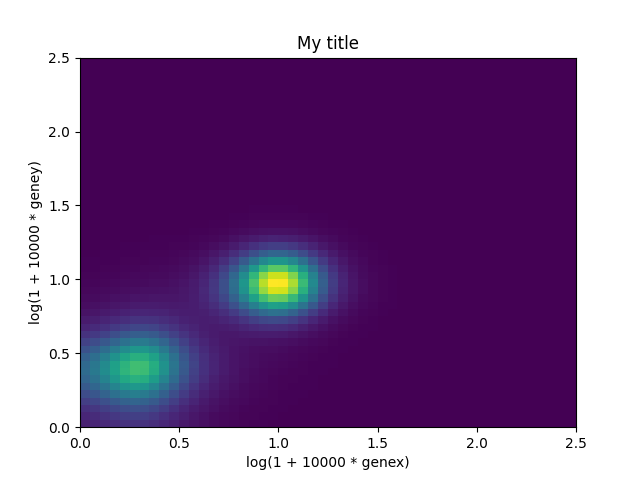
baredSC_2d
We assume you ran the Run baredSC_2d with default parameters.
We will use matplotlib to display the mean pdf in 2d:
In [2]: import numpy as np
   ...: import matplotlib.pyplot as plt
   ...: # Get the pdf
   ...: pdf = np.loadtxt("../example/first_example_2d_cellgroup1_1-3gauss_pdf2d.txt",
   ...:                  delimiter="\t", dtype='S30')
   ...: x = pdf[0, 1:].astype('float')
   ...: y = pdf[1:, 0].astype('float')
   ...: # We assume x and y is equally spaced
   ...: dx = x[1] - x[0]
   ...: xmin = x[0] - dx / 2
   ...: xmax = x[-1] + dx / 2
   ...: x_borders = np.linspace(xmin, xmax, len(x) + 1)
   ...: dy = y[1] - y[0]
   ...: ymin = y[0] - dy / 2
   ...: ymax = y[-1] + dy / 2
   ...: y_borders = np.linspace(ymin, ymax, len(y) + 1)
   ...: plt.figure()
   ...: plt.pcolormesh(x_borders, y_borders, pdf[1:,1:].astype('float'),
   ...:                shading='flat', rasterized=True, cmap='viridis')
   ...: plt.xlabel('log(1 + 10000 * genex)')
   ...: plt.ylabel('log(1 + 10000 * geney)')
   ...: plt.title('My title')
   ...:
Out[2]: Text(0.5, 1.0, 'My title')